CSS Layout
CSS provides various properties to control the layout of elements on a web page. Understanding how to use these properties effectively is crucial for creating complex, responsive layouts that work across different devices and screen sizes.
Display Property
The display property defines how an element is displayed on the page. It’s one of the fundamental properties for layout design.
Common Display Values:
block: The element takes up the full width available, starting on a new line.
p {
  display: block;
}inline: The element takes up only as much width as necessary and does not start on a new line.
p {
  display: block;
}inline-block: The element flows inline but can have width and height set.
.inline-box {
  display: inline-block;
  width: 100px;
  height: 50px;
}none: The element is not displayed on the page (hidden).
.hidden {
  display: none;
}flex: Enables a flexible layout using the Flexbox model.
.container {
  display: flex;
}grid: Enables a grid-based layout.
.grid-container {
  display: grid;
}Positioning (Static, Relative, Absolute, Fixed, Sticky)
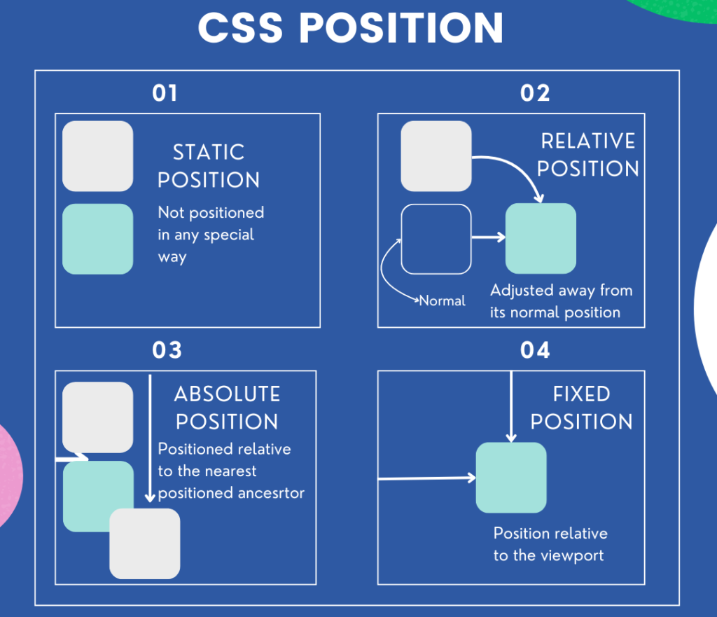
The position property specifies the positioning method of an element. The type of positioning affects how an element is placed in the document flow.

2.1 Static Positioning (static)
- Default value. The element is positioned according to the normal flow of the document.
- The
top,right,bottom, andleftproperties have no effect.
.element {
  position: static;
}2.2 Relative Positioning (relative)
- The element is positioned relative to its original position in the document flow.
top,right,bottom, andleftproperties move the element from its normal position.
.element {
  position: relative;
  top: 10px; /* Moves the element 10px down from its original position */
  left: 20px; /* Moves the element 20px to the right */
}2.3 Absolute Positioning (absolute)
- The element is positioned relative to its closest positioned ancestor (
relative,absolute,fixed, orsticky). If no such ancestor exists, it is positioned relative to the viewport. - The element is removed from the normal document flow.
.element {
  position: absolute;
  top: 0;
  right: 0;
}2.4 Fixed Positioning (fixed)
- The element is positioned relative to the viewport, meaning it stays in place even when the page is scrolled.
- The element is removed from the normal document flow.
.element {
  position: fixed;
  bottom: 0;
  right: 0;
}2.5 Sticky Positioning (sticky)
- The element toggles between
relativeandfixedpositioning based on the user’s scroll position. - It “sticks” to a defined position (
top,right,bottom,left) when the element reaches a specified scroll point.
.element {
  position: sticky;
  top: 20px; /* The element sticks 20px from the top of the viewport */
}Flexbox

Flexbox (Flexible Box Layout) is a one-dimensional layout model that allows you to create flexible and responsive layouts easily. It’s particularly useful for aligning items along a row or column and distributing space within a container.
3.1 Basic Flexbox Properties:
display: flex;: Converts a container into a flex container.
.container {
  display: flex;
}flex-direction: Defines the direction in which flex items are placed. Values:row,row-reverse,column,column-reverse.
.container {
  flex-direction: row;
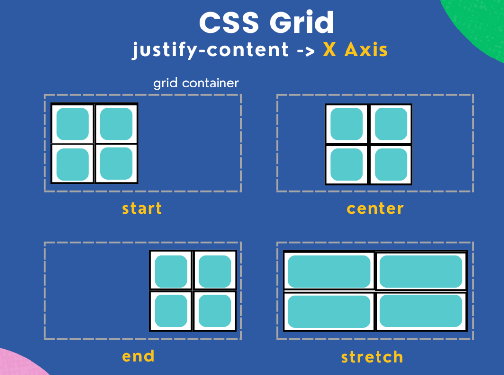
}justify-content: Aligns items along the main axis (horizontally in a row, vertically in a column). Values:flex-start,flex-end,center,space-between,space-around.
.container {
  justify-content: center;
}align-items: Aligns items along the cross axis (vertically in a row, horizontally in a column). Values:flex-start,flex-end,center,stretch.
.container {
  align-items: center;
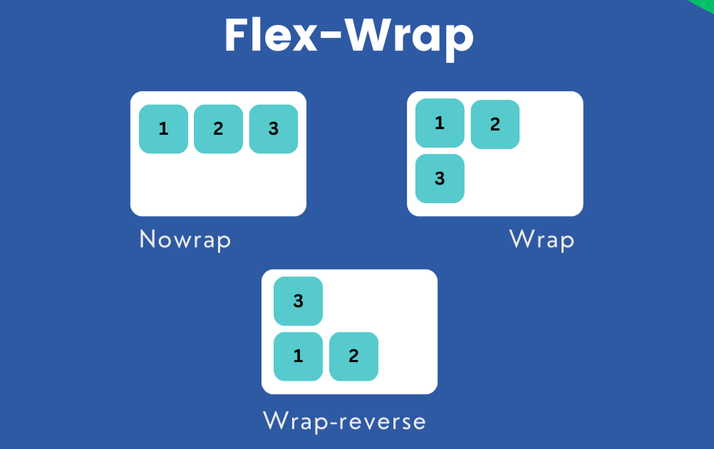
}flex-wrap: Controls whether items wrap onto multiple lines. Values:nowrap,wrap,wrap-reverse.
.container {
  flex-wrap: wrap;
}3.2 Flex Item Properties:
flex: A shorthand forflex-grow,flex-shrink, andflex-basis. It defines how a flex item will grow or shrink to fit the space in the flex container.
.item {
  flex: 1; /* Items will equally share the available space */
}CSS Grid
CSS Grid Layout is a two-dimensional layout system that allows you to create complex layouts with rows and columns.

4.1 Basic Grid Properties:
display: grid;: Converts an element into a grid container.
.grid-container {
  display: grid;
}grid-template-columnsandgrid-template-rows: Defines the size and number of columns and rows.
.grid-container {
  display: grid;
  grid-template-columns: 1fr 1fr 1fr; /* Creates three equal columns */
  grid-template-rows: 100px 200px; /* Creates two rows with specified heights */
}grid-gap: Adds spacing between grid items.
.grid-container {
  grid-gap: 10px;
}4.2 Placing Items in the Grid:
grid-columnandgrid-row: Specifies the position of an item within the grid.
.grid-item {
  grid-column: 1 / 3; /* Spans from column 1 to 3 */
  grid-row: 1 / 2; /* Spans from row 1 to 2 */
}Float and Clear
Floats are a legacy method for creating layouts. While not as commonly used today due to Flexbox and Grid, floats can still be useful for text wrapping and other specific scenarios.
5.1 Float Property:
float: Moves an element to the left or right, allowing text and inline elements to wrap around it.
.image {
  float: left;
  margin-right: 10px;
}5.2 Clear Property:
clear: Prevents elements from wrapping around a floated element. Values:left,right,both.
.clearfix {
  clear: both;
}5.3 The Clearfix Hack:
Floated elements are removed from the normal document flow, which can cause parent containers to collapse. The clearfix hack is used to force the parent to contain its floated children.
.container::after {
  content: "";
  display: table;
  clear: both;
}Summary
CSS layout properties provide powerful ways to position, align, and distribute space within elements on a web page. The display property determines how elements are rendered, while position allows for various placement strategies such as static, relative, absolute, fixed, and sticky. Flexbox offers a one-dimensional layout system ideal for creating responsive rows or columns, and CSS Grid enables more complex, two-dimensional layouts. While float and clear are older layout methods, they can still be useful in certain situations. Mastering these properties is essential for designing flexible, responsive, and visually appealing web layouts.