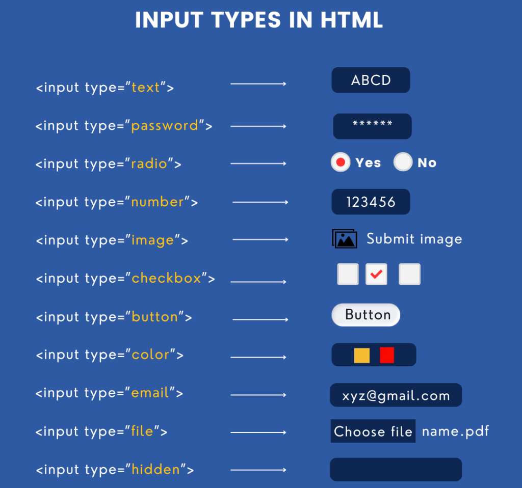
Forms and Input
Forms are essential for collecting user input on web pages. HTML provides a range of form elements and input types to gather various kinds of information. This guide covers the fundamental form elements, input types, form attributes, validation, and some advanced form elements introduced in HTML5.

Form Elements
HTML forms consist of a collection of elements used to gather information from the user.
Basic Form Structure (<form>)
The <form> tag is the container for all input elements. The action and method attributes define where and how to send the form data.
<form action="/submit-form" method="post">
  <label for="username">Username:</label>
  <input type="text" id="username" name="username">

  <label for="email">Email:</label>
  <input type="email" id="email" name="email">

  <button type="submit">Submit</button>
</form>Common Form Elements
<input>: The most versatile form element, used for various input types like text, email, password, number, etc.
<input type="text" name="username" placeholder="Enter your username"><textarea>: For multi-line text input.
<textarea name="message" rows="4" cols="50" placeholder="Enter your message here"></textarea><button>: Defines a clickable button, often used to submit the form.
<button type="submit">Submit</button><select>and<option>: Used to create a drop-down list.
<label for="cars">Choose a car:</label>
<select id="cars" name="cars">
  <option value="volvo">Volvo</option>
  <option value="saab">Saab</option>
  <option value="mercedes">Mercedes</option>
  <option value="audi">Audi</option>
</select><label>: Associates a text label with a form element. Theforattribute of the<label>corresponds to theidof the form element.
<label for="email">Email:</label>
<input type="email" id="email" name="email"><fieldset>and<legend>: Used to group related form elements together. The<legend>provides a caption for the group.
<fieldset>
  <legend>Personal Information</legend>
  <label for="name">Name:</label>
  <input type="text" id="name" name="name">

  <label for="age">Age:</label>
  <input type="number" id="age" name="age">
</fieldset>Input Types
The <input> element has many types, each designed to handle a different kind of data. Here are some commonly used input types:
text: For single-line text input.
<input type="text" name="name" placeholder="Enter your name">password: Hides the input with dots or asterisks.
<input type="password" name="password" placeholder="Enter your password">email: Validates that the input is in an email format.
<input type="email" name="email" placeholder="Enter your email">number: Restricts input to numerical values.
<input type="number" name="age" min="1" max="100" placeholder="Enter your age">date: Provides a date picker.
<input type="date" name="birthday">Form Attributes
The <form> element has several important attributes:
action: Specifies the URL where the form data is sent when it is submitted.
<form action="/submit-form" method="post">method: Defines how the form data is sent. Common values are:get: Appends form data to the URL, used for non-sensitive data.post: Sends form data as an HTTP POST request, suitable for sensitive or large amounts of data.
enctype: Used withmethod="post"to specify how form data should be encoded. Common values:application/x-www-form-urlencoded(default): Encodes form data in the URL.multipart/form-data: Used for forms with file uploads.
<form action="/upload" method="post" enctype="multipart/form-data">target: Specifies where to display the response. Common values:_self(default): Opens in the same window._blank: Opens in a new window or tab.
<form action="/submit" method="post" target="_blank">Validation and Error Messages
HTML5 provides built-in form validation without JavaScript. You can use various attributes to enforce rules on the input fields:
required: Specifies that the input field must be filled out.
<input type="text" name="username" required>min,max: Sets the minimum and maximum values for numeric inputs.
<input type="number" name="age" min="1" max="100">pattern: Defines a regular expression that the input’s value must match.
<input type="text" name="zipcode" pattern="[0-9]{5}" placeholder="Enter 5-digit ZIP code">maxlength,minlength: Sets the maximum and minimum number of characters allowed.
<input type="text" name="username" minlength="4" maxlength="12">- Error Messages: When the user enters invalid input, the browser displays a built-in error message. You can customize this using the
titleattribute or JavaScript for advanced control.
Advanced Form Elements
<datalist>
The <datalist> element provides a list of pre-defined options for an <input> element, creating an auto-complete effect.
<label for="browsers">Choose a browser:</label>
<input list="browsers" id="browser" name="browser">
<datalist id="browsers">
  <option value="Chrome">
  <option value="Firefox">
  <option value="Safari">
  <option value="Edge">
</datalist><output>
The <output> element displays the result of a calculation or an action.
<form oninput="result.value=parseInt(a.value)+parseInt(b.value)">
  <input type="number" id="a" value="0"> +
  <input type="number" id="b" value="0"> =
  <output name="result" for="a b">0</output>
</form><keygen> (Deprecated)
The <keygen> element was used for generating a key-pair for forms that use certificates for authentication. However, it has been deprecated and is not recommended for use in modern web development.
HTML5 Input Types and Attributes
HTML5 introduced several new input types and attributes to enhance form functionality:
search: Similar totextbut optimized for search queries.
<input type="search" name="query" placeholder="Search...">range: Provides a slider control for numeric input.
<input type="range" name="volume" min="0" max="100">color: Opens a color picker.
<input type="color" name="favcolor">tel: For telephone numbers. Offers some validation and custom keyboard on mobile devices.
<input type="tel" name="phone" placeholder="123-456-7890">Summary
HTML forms are an essential tool for gathering user input. By using elements like <input>, <textarea>, <select>, and form attributes such as action and method, you can create interactive and user-friendly forms. HTML5 introduced new input types (e.g., email, number, range) and attributes (e.g., required, pattern) to enhance form validation and functionality. Additionally, advanced elements like <datalist> and <output> provide more dynamic user interactions, while built-in validation simplifies error checking without JavaScript. Understanding these elements and how to use them effectively is key to building robust web forms.