Contents
Responsive Web Design
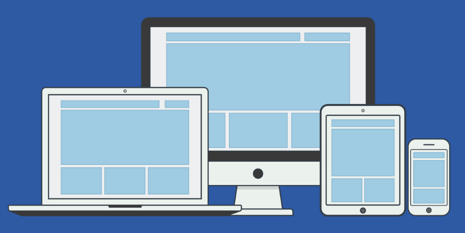
Responsive Web Design (RWD) ensures that a website looks and functions well across different devices and screen sizes, from large desktop monitors to small mobile screens. This approach involves using flexible layouts, media queries, responsive images, and a mobile-first design philosophy to adapt the content to various viewport sizes.

Media Queries
Media queries are a CSS feature that allows you to apply different styles to a webpage based on the device’s characteristics, such as screen size, resolution, and orientation. They are the cornerstone of responsive design, enabling content to adjust for various devices.
Basic Syntax of Media Queries:
					@media (max-width: 768px) {
  /* Styles for screens with a width of 768px or less */
  body {
    background-color: lightblue;
  }
}

@media (min-width: 769px) and (max-width: 1200px) {
  /* Styles for screens between 769px and 1200px */
  body {
    background-color: lightgreen;
  }
}

@media (orientation: landscape) {
  /* Styles for landscape orientation */
  body {
    background-color: lightcoral;
  }
}
Common Media Query Breakpoints:
Breakpoints are specific screen widths where the layout of the webpage changes to accommodate different devices.
- Small devices (phones):
max-width: 600px - Medium devices (tablets):
min-width: 601pxandmax-width: 768px - Large devices (desktops):
min-width: 769px
Responsive Font Size:
Adjust the font size based on screen size for better readability.
					body {
  font-size: 16px;
}

@media (max-width: 600px) {
  body {
    font-size: 14px;
  }
}

@media (min-width: 768px) {
  body {
    font-size: 18px;
  }
}
Flexible Grid Layouts
A flexible grid layout allows for a fluid layout where elements resize, reposition, and adapt to different screen sizes using relative units like percentages, fr units (for CSS Grid), and flexible container properties.
2.1 Using Flexbox for Responsive Layouts:
Flexbox is a layout model that enables easy alignment and distribution of space among items in a container.
					.container {
  display: flex;
  flex-wrap: wrap;
  gap: 20px;
}

.item {
  flex: 1 1 200px; /* Grow, shrink, and base size */
}
flex: 1 1 200px;: This sets the items to be flexible, allowing them to grow (1), shrink (1), and have a base size of200px.
2.2 Using CSS Grid for Flexible Layouts:
CSS Grid provides a two-dimensional layout system for more complex designs, such as multi-row and multi-column layouts.
					.grid-container {
  display: grid;
  grid-template-columns: repeat(auto-fit, minmax(200px, 1fr));
  gap: 20px;
}
repeat(auto-fit, minmax(200px, 1fr));: This creates a flexible grid layout that automatically adjusts the number of columns based on the available space.
Example: Responsive Two-Column Layout with Grid:
					.container {
  display: grid;
  grid-template-columns: 1fr 1fr;
  gap: 20px;
}

@media (max-width: 768px) {
  .container {
    grid-template-columns: 1fr;
  }
}
This layout starts with two columns and switches to a single-column layout on smaller screens (below 768px).
Responsive Images
Responsive images adjust to different screen sizes, improving load times and providing the best quality for each device.
3.1 Using srcset Attribute:
The srcset attribute allows you to define different image files for various screen sizes and resolutions.
					<img decoding="async" src="image-small.jpg"
     srcset="image-small.jpg 600w, image-medium.jpg 1200w, image-large.jpg 2000w"
     sizes="(max-width: 600px) 100vw, (max-width: 1200px) 50vw, 33vw"
     alt="Sample Image">
srcset: Lists the image files with their respective widths.sizes: Defines the display width for each condition.
3.2 Using the <picture> Element for Art Direction:
The <picture> element provides greater control over which image to display in different scenarios, like changing the image based on screen size or orientation.
					<picture>
  <source media="(max-width: 600px)" srcset="image-small.jpg">
  <source media="(max-width: 1200px)" srcset="image-medium.jpg">
  <img decoding="async" src="image-large.jpg" alt="Sample Image">
</picture>
3.3 Lazy Loading Images:
The loading attribute enables lazy loading of images, which defers loading images until they are visible in the viewport, improving initial page load times.
<img decoding="async" src="image.jpg" alt="Lazy Loaded Image" loading="lazy">
Mobile-First Design Approach
Mobile-first design is a strategy where you start designing for the smallest screen size first and gradually add complexity for larger screens using media queries. This approach ensures that your website is optimized for mobile devices, which account for a large portion of web traffic.
Why Mobile-First?
- Most users access websites through mobile devices.
- Encourages simpler, more efficient design.
- Enhances performance by loading only necessary content for mobile users.
Mobile-First CSS Example:
					/* Base styles for mobile-first */
.container {
  display: block;
  padding: 10px;
  font-size: 16px;
}

/* Styles for larger screens */
@media (min-width: 768px) {
  .container {
    display: flex;
    padding: 20px;
    font-size: 18px;
  }
}
In this example, the default styling is set for mobile devices. Additional styles are added for larger screens using media queries (min-width: 768px).
Summary
Responsive Web Design (RWD) is essential for building websites that provide a great user experience across all devices. Media queries allow you to define styles for different screen sizes and orientations. Flexible grid layouts using Flexbox or CSS Grid create adaptable layouts that adjust to varying viewport dimensions. Responsive images using srcset, <picture>, and lazy loading techniques ensure optimal image quality and performance. Adopting a mobile-first design approach helps prioritize mobile users and build efficient, scalable designs. By implementing these practices, you can create a website that is both user-friendly and accessible, regardless of the device.